
Top 6 flutter loading indicators and gifs packages in the pub.dev, These are very beautiful progress indicators to easily use in any flutter app.
1. Flutter Spinkit ( flutter_spinkit )
A collection of loading indicators animated with flutter. Heavily inspired by @tobiasahlin's SpinKit.
Installing
dependencies:
  flutter_spinkit: "^4.1.2"
⚡️ Import
import 'package:flutter_spinkit/flutter_spinkit.dart';
🎮 How To Use
const spinkit = SpinKitRotatingCircle(
  color: Colors.white,
  size: 50.0,
);
final spinkit = SpinKitFadingCircle(
  itemBuilder: (BuildContext context, int index) {
    return DecoratedBox(
      decoration: BoxDecoration(
        color: index.isEven ? Colors.red : Colors.green,
      ),
    );
  },
);
final spinkit = SpinKitSquareCircle(
  color: Colors.white,
  size: 50.0,
  controller: AnimationController(vsync: this, duration: const Duration(milliseconds: 1200)),
);
For more info, please, refer to the showcase.dart in the example.
Showcase


Circle CubeGrid FadingCircle


RotatingCircle FoldingCube PumpingHeart


FadingGrid Ring Ripple


SpinningCircle SquareCircle


2. Flutter Loading Animations ( loading_animations )
A simple yet very customizable set of loading animations for Flutter projects.Installation
Add the following to your pubspec.yaml file:
...
dependencies:
  ...
  loading_animations: "^2.1.0"
...
Then import the file to your project:
import 'package:loading_animations/loading_animations.dart';
How to use
Choose a loading animation from the list:
Flipping
LoadingFlipping.circle()LoadingFlipping.square()
Rotating
LoadingRotating.square()
Double Flipping
LoadingDoubleFlipping.circle()LoadingDoubleFlipping.square()
Bouncing Grid
LoadingBouncingGrid.circle()LoadingBouncingGrid.square()
Filling
LoadingFilling.square()
Fading Line
LoadingFadingLine.circle()LoadingFadingLine.square()
Bouncing Line
LoadingBouncingLine.circle()LoadingBouncingLine.square()
Jumping Line
LoadingJumpingLine.circle()LoadingJumpingLine.square()
Bumping Line
LoadingBumpingLine.circle()LoadingBumpingLine.square()
Then add the following code:
LoadingFlipping.circle(
  color: Colors.blue,
);
Or you can customize it a bit:
LoadingFlipping.square(
  borderColor: Colors.cyan,
  size: 30.0,
);
Or customize it even more!
LoadingFlipping.circle(
  borderColor: Colors.cyan,
  borderSize: 3.0,
  size: 30.0,
  backgroundColor: Colors.cyanAccent,
  duration: Duration(milliseconds: 500),
);
For more customization, please look inside the loading animation files.
Note: all the animations come ready to go just by calling LoadingDoubleFlipping.square(), for example.
Many basic animations contain .circle() and .square() variations by default.
Examples
Note: the following gifs are not yet updated to reflect version 2.1.0
For a more true experience of the animations and its variations, download the example project and run using flutter run --profile.
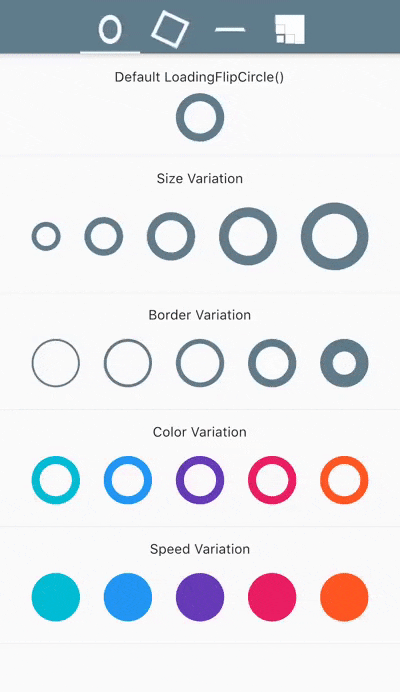
LoadingFlipCircle()
LoadingRotatingSquare()

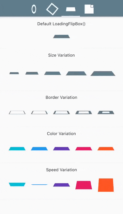
LoadingFlipBox()
LoadingBouncingGrid()

3. LoadingIndicator ( loading_indicator )
Animation types
| Type | Type | Type | Type |
|---|---|---|---|
| 1. ballPulse | 2. ballGridPulse | 3. ballClipRotate | 4. squareSpin |
| 5. ballClipRotatePulse | 6. ballClipRotateMultiple | 7. ballPulseRise | 8. ballRotate |
| 9. cubeTransition | 10. ballZigZag | 11. ballZigZagDeflect | 12. ballTrianglePath |
| 13. ballScale | 14. lineScale | 15. lineScaleParty | 16. ballScaleMultiple |
| 17. ballPulseSync | 18. ballBeat | 19. lineScalePulseOut | 20. lineScalePulseOutRapid |
| 21. ballScaleRipple | 22. ballScaleRippleMultiple | 23. ballSpinFadeLoader | 24. lineSpinFadeLoader |
| 25. triangleSkewSpin | 26. pacman | 27. ballGridBeat | 28. semiCircleSpin |
| 29. ballRotateChase | 30. orbit | 31. audioEqualizer | 32. circleStrokeSpin |

4. Loading GIFs ( loading_gifs )
Loading GIFs is a collection of high fidelity loading animations in GIF format. Included are Android "Material Design" and iOS "Cupertino" default loading indicators.

Import this library into your project:
loading_gifs: ^latest_version
Use cupertinoActivityIndicator or circularProgressIndicator where ever a loading image is needed.
FadeInImage.assetNetwork(placeholder: cupertinoActivityIndicator, image: "image.png");
That's it!
Usage Tips

Size
This library is optimized for size so it only includes the base asset sizes. Change the size of the loading spinners using scale and placeholderScale.
FadeInImage.assetNetwork(placeholder: cupertinoActivityIndicator, image: "image.png", placeholderScale: 5);

Image.asset(circularProgressIndicator, scale: 10);
Dynamic Images
When loading images whose dimensions are unknown ahead of time, use cupertinoActivityIndicatorSmall instead of cupertinoActivityIndicator. cupertinoActivityIndicatorSmall is a min height variant of cupertinoActivityIndicator which allows Flutter to correctly expand the loaded image into the layout.
The small variant should be used when loading a list of images or compositing an image from multiple images.
  ListView(
    children: <Widget>[
      FadeInImage.assetNetwork(
          placeholder: cupertinoActivityIndicatorSmall,
          image: "image_1.png"),
      FadeInImage.assetNetwork(
          placeholder: cupertinoActivityIndicatorSmall,
          image: "image_2.png"),
      FadeInImage.assetNetwork(
          placeholder: cupertinoActivityIndicatorSmall,
          image: "image_3.png"),
    ],
  )
Empty Placeholder
FadeInImage requires a valid placeholder image to avoid "Asset not found" errors. Use placeholderEmpty, a 1x1 pixel transparent PNG, when an empty placeholder is needed.
FadeInImage.assetNetwork(placeholder: placeholderEmpty, image: "image.png");5. loading_overlay
A simple widget wrapper to enable modal progress HUD (a modal progress indicator, HUD = Heads Up Display).
A fork of mobile_progress_hud Inspired by this article.
Demo
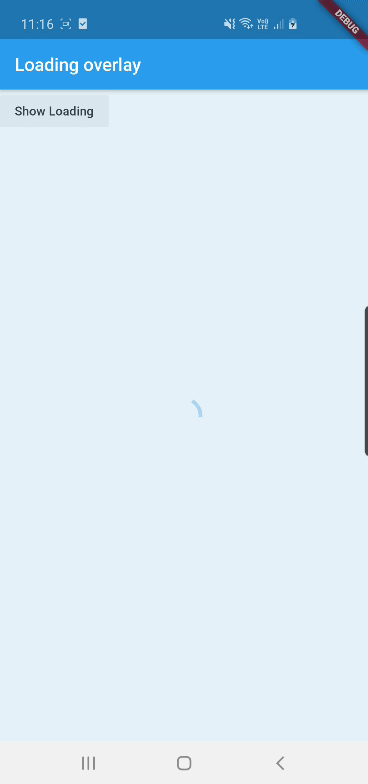
See example for details
Usage
Add the package to your pubspec.yml file.
dependencies:
  loading_overlay: ^0.2.1
Next, import the library into your widget.
import 'package:loading_overlay/loading_overlay.dart';
Now, all you have to do is simply wrap your widget as a child of ModalProgressHUD, typically a form, together with a boolean that is maintained in local state.
...
bool _saving = false
...

@override
Widget build(BuildContext context) {
  return Scaffold(
     body: LoadingOverlay(child: Container(
       Form(...)
     ), isLoading: _saving),
  );
}
Options
The current parameters are customizable in the constructor
LoadingOverlay({
    @required this.isLoading,
    @required this.child,
    this.opacity = 0.5,
    this.progressIndicator = const CircularProgressIndicator(),
    this.color,
});
6. rounded_loading_button

Installation
Add this to your pubspec.yaml:
dependencies:
    rounded_loading_button: ^1.0.0
Usage
Import
import 'package:rounded_loading_button/rounded_loading_button.dart';
Simple Implementation
final RoundedLoadingButtonController _btnController = new RoundedLoadingButtonController();

void _doSomething() async {
    Timer(Duration(seconds: 3), () {
        _btnController.success();
    });
}

RoundedLoadingButton(
    child: Text('Tap me!', style: TextStyle(color: Colors.white)),
    controller: _btnController,
    onPressed: _doSomething,
)


0 Comments
Welcome! Please Comment Without Any Hesitation.
Thank You